

Labsy
peptides & sarms
Visual Identity ∙ Brand Strategy ∙ Webstore
Visual Identity ∙ Website
The main activity of the Labsy brand is the production and distribution of high-quality peptides tailored to the needs of its customers. The company provides a wide range of products in various forms, and thanks to the latest technologies and strict quality standards, peptides from Labsy are effective and safe for use.
What sets Labsy apart is its professionalism and modern approach unprecedented in the peptide market.
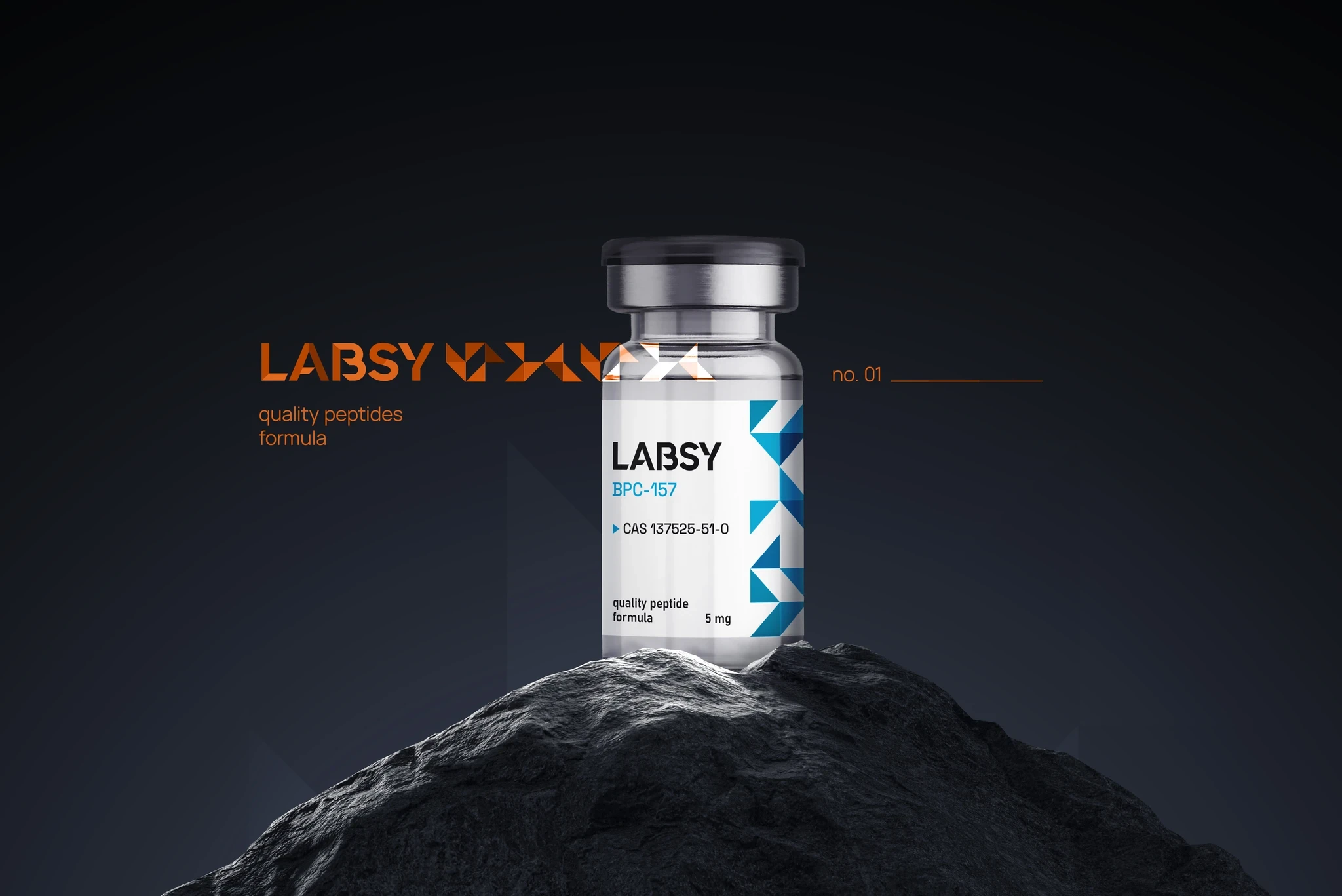


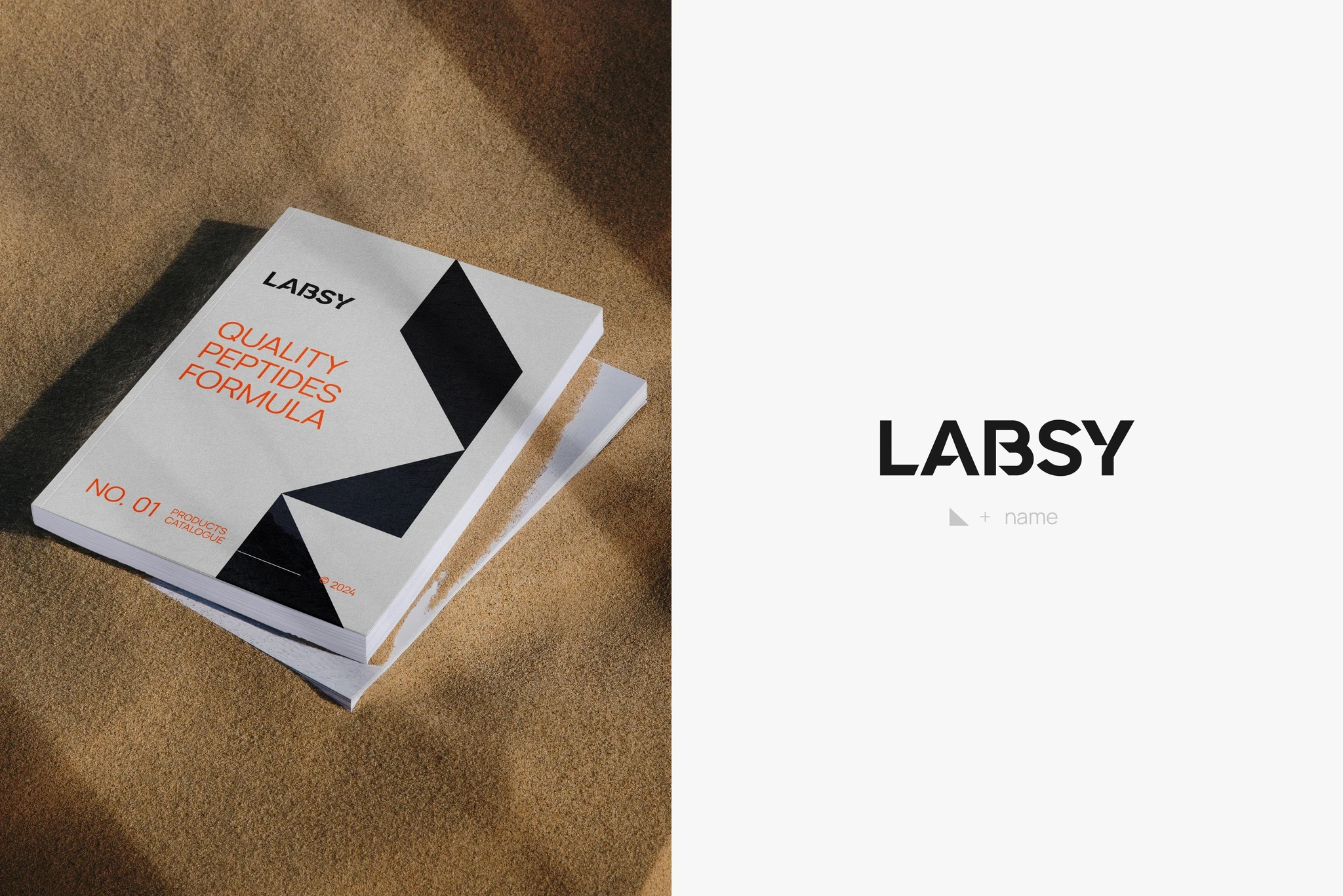
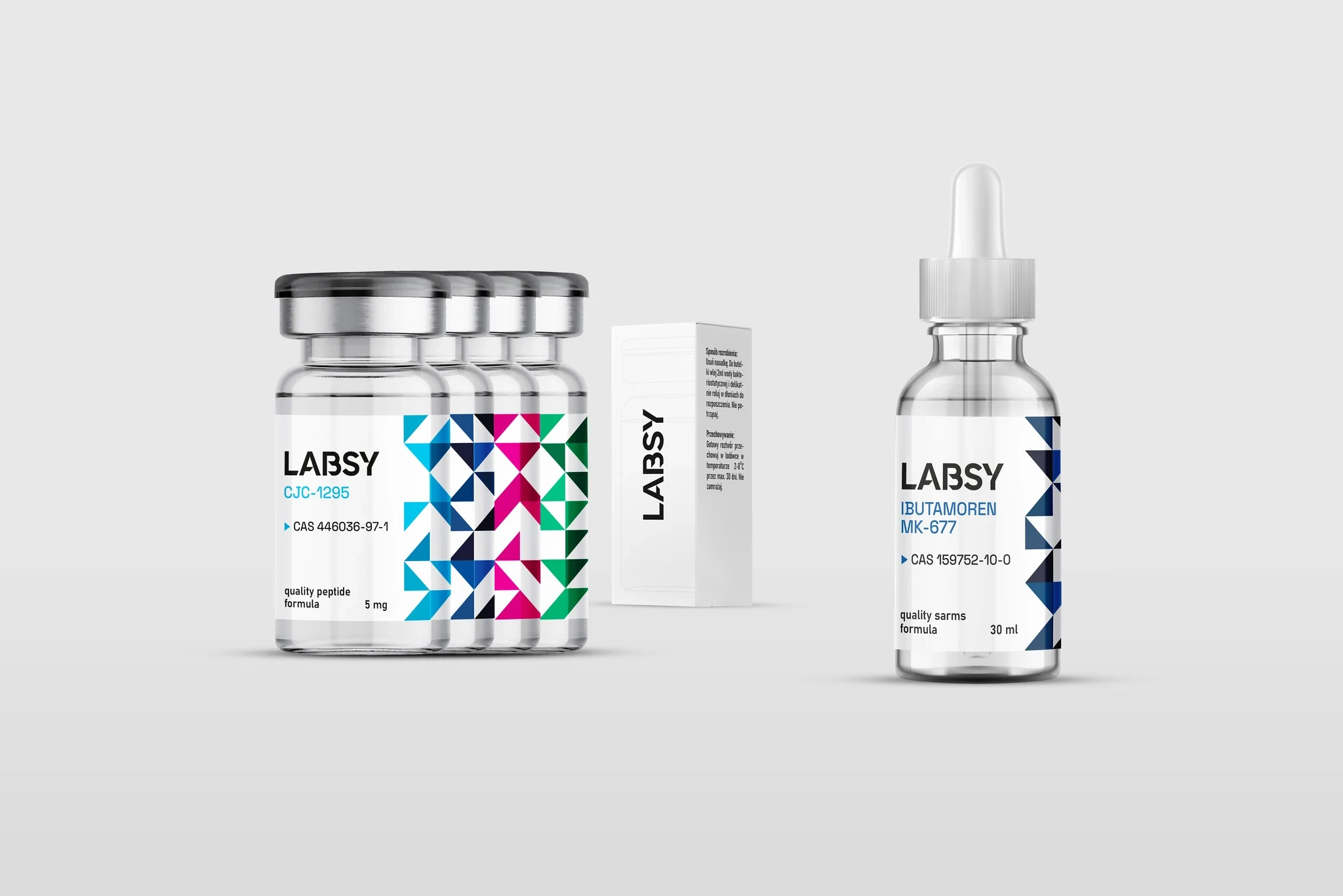
Together with the client, we wanted to transfer the idea behind Labsy - professionalism and modernity - into a visual form. For this reason, we opted for clean, lab-grade white combined with a dynamic but also balanced form of right-angled triangles.What sets Labsy apart is professionalism and a modern approach unprecedented in the peptide market.


Due to the manufacturer's extensive range of products, we have adopted a color-distinct categorization, consistent regardless of the form of the peptide. The color palette - except for white - was adapted to the characteristics of the products.
Each group also got an individually designed pattern of triangles, also used in further communication.


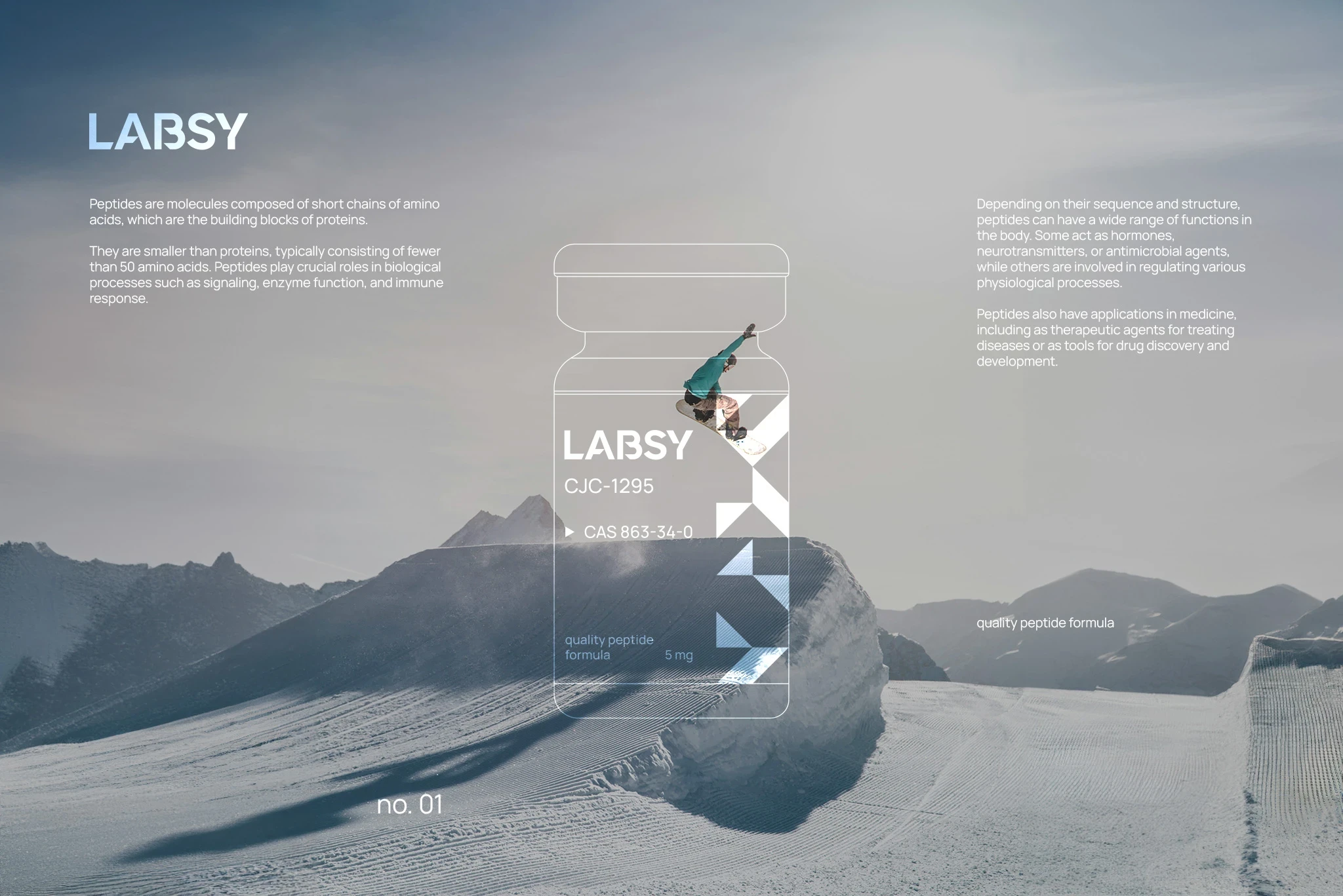
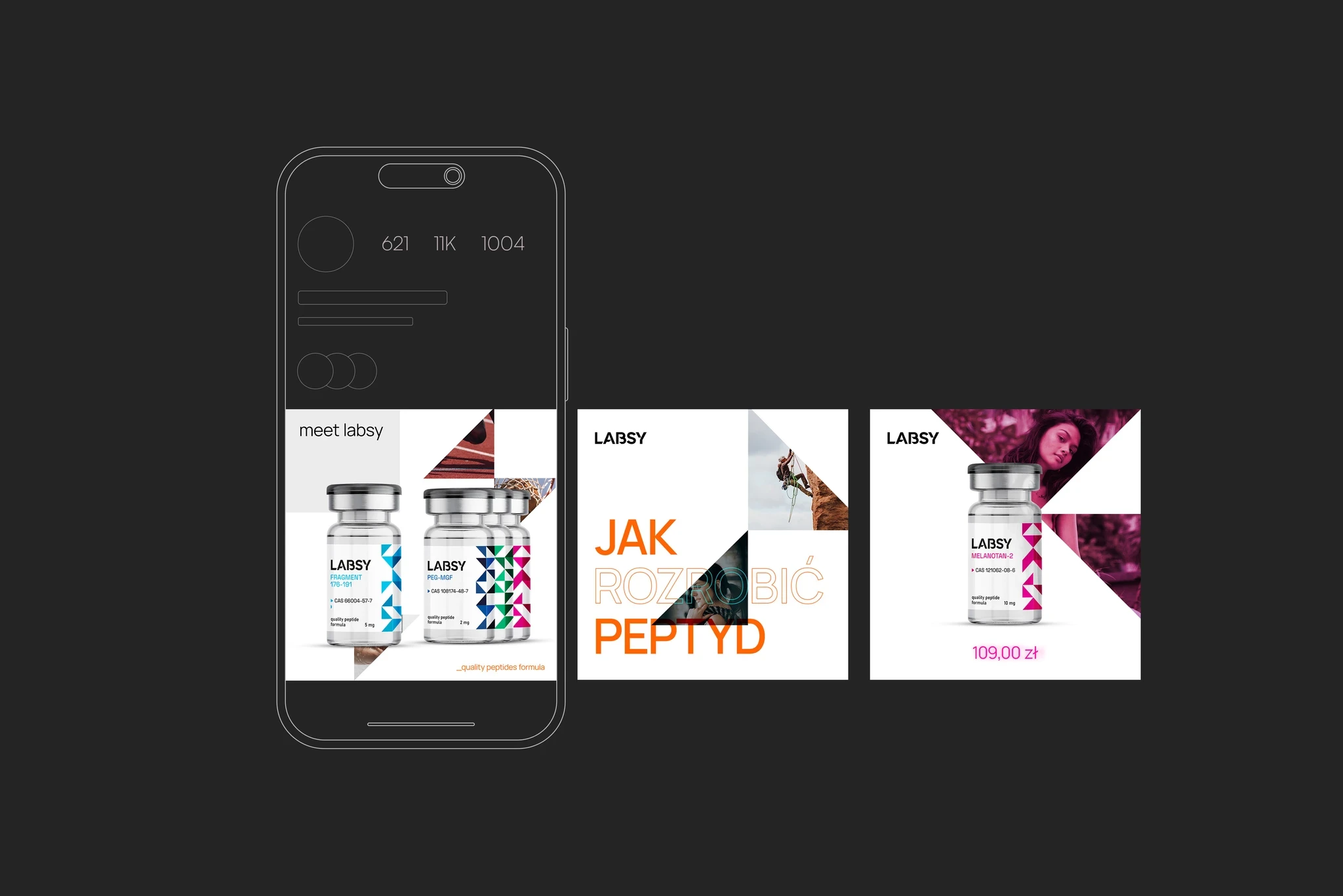
We wanted to maintain consistency, so in our communication with clients we opted for a decidedly more dynamic form - weaving in photos that refer to the product's operation, colors, play with typography and a more creative approach.


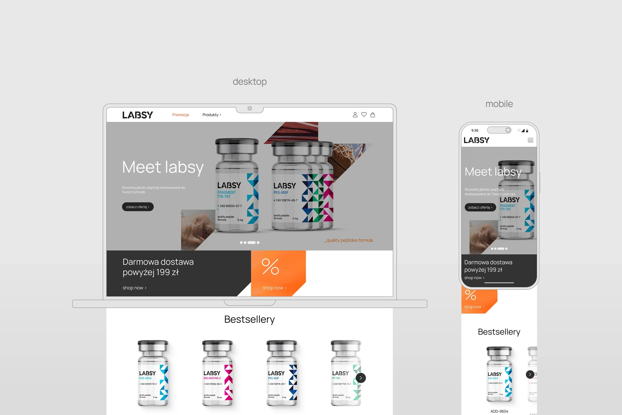
The layout of the store was based on minimalist aesthetics presenting all products. We used a rather asymmetrical layout of the page, also filled with small flavors in the form of additional graphic elements.


